


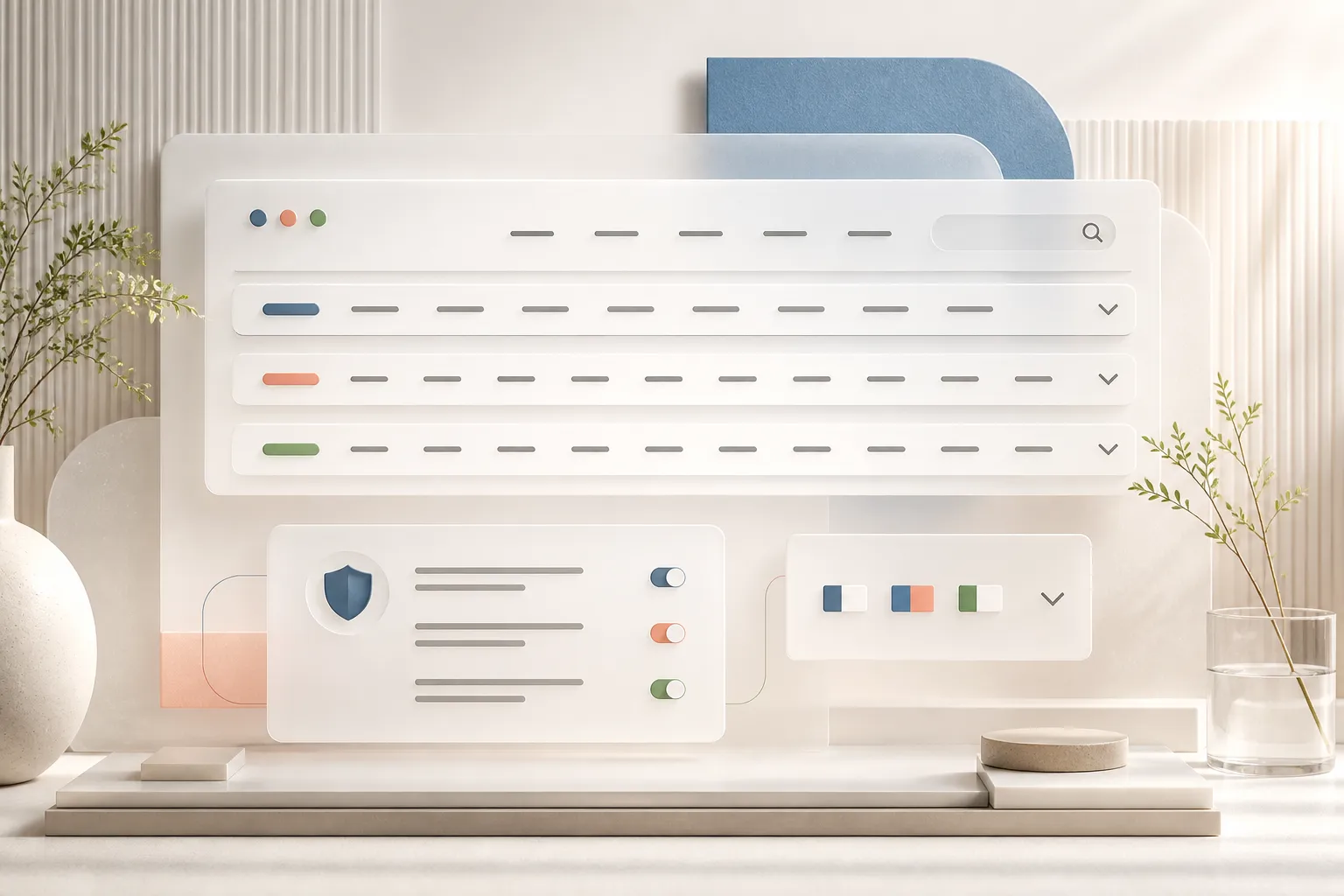
The strongest interfaces are not designed for perfect content. They are designed to stay clear when labels grow, options multiply and a small screen changes the rules. This case study turns a working header, privacy notice and language selector into a practical demonstration of resilient content design.
1. Navigation that makes room
What happened when five links became fourteen—and why hiding overflow was not good enough.
We tested the header with an intentionally overloaded menu. Search and language controls first disappeared beyond the viewport, then remained visible while the final links were clipped. The finished solution reserves space for key actions, lets navigation links wrap across rows and allows the header to grow without making the page wider than the screen. This is content resilience in practice: no destination is hidden simply because the editor added another link.
2. Language choices people can understand
Flags gained language codes, a clear chevron and a mobile layout with a stronger visual rhythm.
English, Norwegian and Swedish are represented by real SVG flags and the visible codes EN, NO and SE. A 16-pixel chevron shows that the control opens, aria-expanded communicates state to assistive technology, and the menu provides generous 36-pixel flag artwork. On mobile, the active code moves below the flag so the selector aligns naturally beside the burger instead of being squeezed by the word “Language”.
3. Privacy and search with clear hierarchy
Two utility patterns were refined until they felt like intentional parts of the product.
The privacy notice now opens with “We value your privacy”, uses 16 pixels of padding, a white surface and a subtle #ccc border. The primary Privacy choices action is black with white text, and the open control has a crisp 1-pixel white border. Search is wider on desktop and becomes a compact 54-pixel field on mobile, with a white button and black border positioned neatly inside the input. Both patterns communicate hierarchy through contrast, spacing and placement—not through extra explanation.
Demo checklist: what this page proves
A compact inventory for customer conversations, implementation reviews and content handover.
- Content can grow without hiding navigation Search and language actions remain anchored Desktop and mobile receive purpose-built layouts Language controls combine visual and textual cues Toggle state is exposed for accessibility Privacy actions use clear visual hierarchy Long copy is constrained for comfortable reading SVG flags stay sharp at every size CMS editors can combine prose with structured factboxes The same content model supports both editorial storytelling and product documentation
The interface checklist
A compact summary of the decisions that turned a fragile header into a resilient interface.
- 16 px padding in the privacy notice White notice surface with a subtle #ccc border Black Privacy choices button with white text 1 px white border on the privacy-open control 260 px desktop search field and a 54 px mobile search control Three language options with 36 px flags and visible EN, NO and SE codes A 16 px chevron with an accessible expanded state Navigation links that wrap instead of disappearing Search and language controls that stay anchored to the right on desktop Mobile flag and language code arranged on separate rows